By last Friday, rates had improved so much from recent highs that we were finally able to consider that 2022's trend had shifted gears from "skyrocketing" to "sideways." While that possibility can still be entertained, this week's rates are definitely higher.
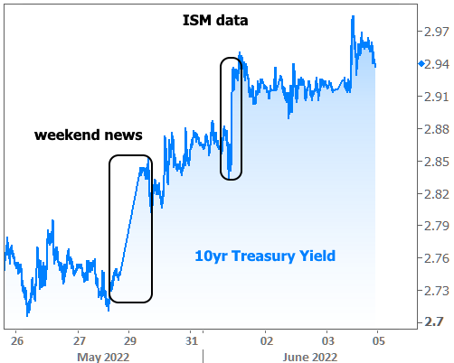
Here's how things look when we zoom in to just the past 6 weeks:

Context is important. While these would be big swings during normal times, they are par for the course during 2022's heightened volatility.

In hoping for a shift to a sideways trend, we're simply hoping to avoid breaking back above the peak seen at the beginning of May. Such an achievement will likely have a lot to do with economic data.
2022's most closely-watched economic reports are those that pertain directly to inflation. In fact, for most of the year, the biggest reactions in rates have followed inflation reports and the policy response from the Fed.
In the absence of any big ticket inflation reports this week, markets were forced to look elsewhere for inspiration. They found it over the weekend in overseas market developments. These included the lifting of covid lockdowns in China and record-setting inflation in the Eurozone.
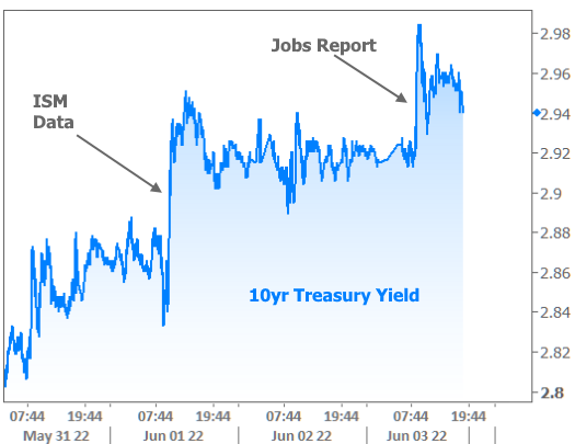
The holiday closure of U.S. bond markets on Monday made for an abrupt start to the week on Tuesday. The following day, bonds were spooked once again by a key report from the Institute for Supply Management (ISM) that showed stronger than expected growth in the manufacturing sector.

10yr Treasury Yields don't directly dictate mortgage rates, but they tend to move in the same direction in similar proportion over time. They also give us a way to view more granular movement in the bond market. This is useful because bonds are the primary ingredient used by lenders to determine mortgage rates. Granted, there are bonds that directly pertain to the mortgage market (MBS), but they require a bit more explanation because they trade in PRICE (which moves inversely to rates). Either way, the takeaway is the same for this week's rate volatility.

It's interesting to consider just how prominent the bond market's reaction was to the ISM data. Although ISM has one of the strongest track records among other economic reports when it comes to inspiring rate movement, the impact has been lighter than normal over the past few years. Most recently, this could be chalked up to the market's hyperfocus on inflation.
But now that inflation is attempting to turn a corner, and on a week without any major inflation data, markets were free to consider the implications of other economic data. The interesting part is how big the reaction was RELATIVE to where the ISM numbers came in. The following chart shows the consensus among economic forecasters and the actual result.

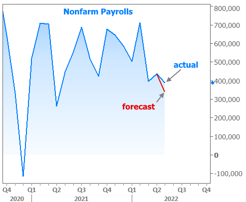
In other words, it doesn't seem like such a small divergence from expectations should have mattered. To a slightly lesser extent, the same was true for Friday's big jobs report, which also resulted in bond yields moving higher.

And here's how the job count fared versus the forecast:

What this tells us is that there's a bit of a mismatch between economists and traders with the market having apparently bought in to a gloomier outlook. While the gloom may yet prove to be justified, the disagreement in the data is giving pause to recent rate-friendly trends.
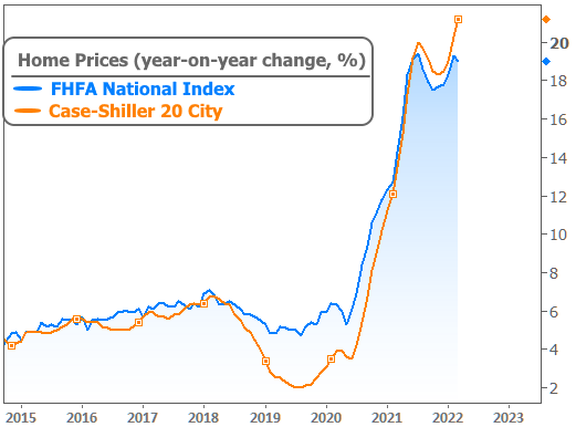
There was a smattering of other economic reports this week and while none of them moved the needle like those referenced above, at least one of them was quite interesting. Specifically, home prices continued to rise at a pace that suggests very little concern for rates. In fact, when it comes to Case-Shiller's 20-metro-area index, price appreciation set a new year-over-year record.

Does this actually mean prices don't care about rates? That's a complicated question. Certainly, rising rates combined with staggering price increases mean that affordability has suffered. In turn, the affordability situation will increasingly dampen homebuying demand. In the coming months, we'll likely see the effects in the home price data.
So why haven't we seen it yet? That's also not the most easily answered question, but there's at least one simple consideration: the home price data only covers transactions that closed in March. The prices associated with those transactions were decided at least another month prior. In other words, there's some lag (and yes, there are other complicating factors as well including but not limited to supply/demand imbalances in many areas).
Bottom line, don't be surprised when the lines in the chart above begin to fall. They will. And that's actually a good thing (because this pace of appreciation is unsustainable). What we can't currently know is what the reversal in appreciation will look like and whether it will give way to actual declines in value.


